Tech Mean Reversion 3.0?

HISTORICALLY OVEREXTENDED

 For anyone who followed the previous blog, you're familiar with the concept of 'Market Variance.'  It's used to describe situations where price actions have moved away from a trailing average in a significant way.

https://bluehorseshoefinance.blogspot.com/2018/11/market-data-analytics-variance-revisited.html

Typically, my writing has focused on one day candle charts but a market variance of historic proportions has emerged in the Nasdaq monthly chart that is certainly worth taking note of. 

Here's a historical Nasdaq 100 chart with monthly candles:

The blue line in the chart represents the 20 period simple moving average (will now be referred to as the 20 SMA).  As of this writing, the 20 SMA is at 8927 while the Nasdaq current price is 11665... a huge nominal difference to say the least.

The technical indicator previously cited, Market Variance, was built to quantify the extent to which a price varies from some appreciable mean relative to historical dispersions.

For the record, I fully realize this is not the technical definition of 'variance', but rather an appropriation made for illustration.

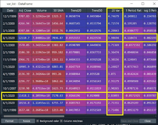
At the end of September, the Nasdaq's monthly candle 'variance' to the 20 SMA was 2.83. For context, the fourth quartile variance for the Nasdaq monthly candle data set is 1.792.  

For all instances where the adjusted closing price is above the 50 SMA, September's historical variance of 2.83 is inside the 90th percentile for the data set which dates back to 1993.

 
 More interestingly, the August closing variance of 3.99 was the fourth largest in the data set, only to be outdone by variance readings leading up to the dotcom crash of 2000.

WHY THIS MATTERS

To illustrate why this matters, let's consider a common automated trading strategy, the Mean Reversion.  Typically, mean reverting algorithms use Bollinger Bands to determine when a market is overbought or oversold.  

Going back to the monthly bar chart, we see the NDX is currently well outside of its 2 upside standard deviation band and is challenging the limits of its 3 upside standard deviation band...


...this pattern was repeated in late 1999/early 2000 and October, 2007.  These same time periods also happen to show up on our historical rankings of the 'Variance' statistic.  

One can only assume that every mean reversion algorithm trading the monthly Nasdaq 100 is flashing a huge giant red sell signal right now.




Comments

Popular posts from this blog

Modeling Credit Risk...

     Here's a link to a presentation I gave back in August on modeling credit risk.  If anyone would like a copy of the slides, go ahead and drop me a line... https://www.gotostage.com/channel/39b3bd2dd467480a8200e7468c765143/recording/37684fe4e655449f9b473ec796241567/watch      Timeline of the presentation: Presentation Begins:                                                                0:58:00 Logistic Regression:                                     ...

Modeling Black-Litterman; Part 1 - Reverse Optimization

  "The 'radical' of one century is the 'conservative' of the next." -Mark Twain In this series, I'm going to explore some of the advances in portfolio management, construction, and modeling since the advent of Harry Markowitz's Nobel Prize winning Modern Portfolio Theory (MPT) in 1952. MPT's mean-variance optimization approach shaped theoretical asset allocation models for decades after its introduction.  However, the theory failed to become an accepted industry practice, so we'll explore why that is and what advances have developed in recent years to address the shortcomings of the original model. The Problems with Markowitz For the purpose of illustrating the benefits of diversification in a simple two-asset portfolio, Markowitz's model was a useful tool in producing optimal weights at each level of assumed risk to create efficient portfolios.   However, in reality, investment portfolios are complex and composed of large numbers of holdin...

Evidence the SPY is Overbought...

 A quick note on the recent market rally here of late.  It's plain to see the markets have been on a tear for the month of June (and going back into May for the QQQ) as the SPY closed today at its highest level in almost fourteen months. If we start to look at the historical levels, however, it appears the SPY may be overbought in the short-run and susceptible to a mean-reverting pattern. Here's the daily chart of the SPY as of today's (6/15/23) close... When looking at the distance between the closing price and the 50-day moving average (illustrated by the yellow bar), we're noticing a large gap... this can be measured by a statistic I developed which I casually refer to as "variance"... or the distance between current prices and their respective moving averages. Historically, throughout the life of the SPY (which debuted in January of '93), the variance over the 50-day moving average has peaked at a reading of 3.20... today's reading posts up at 2.49...